
In a subscriber's crowded inbox, your email has just a few seconds to make an impression. Will it be opened, or will it be instantly archived? The difference often comes down to one crucial factor: design. A well-designed email does more than just look good; it builds trust, guides the reader's eye, and makes it effortless for them to take the next step. Poor design, on the other hand, creates friction, confuses your message, and ultimately sabotages your campaign's performance.
This guide provides a prioritized, actionable collection of the most impactful email design best practices that directly influence engagement and conversions. We'll explore how to craft compelling calls-to-action, optimize images for fast loading, and structure your content for maximum scannability. Whether you're a small business owner or a seasoned marketer, this is your blueprint for creating emails that not only capture attention but also drive meaningful results.
1. Adopt a Mobile-First, Responsive Design
Designing for mobile devices first is no longer optional; it's a fundamental requirement. A mobile-first approach means designing for the smallest screen and then scaling up for larger displays. Given that a majority of emails are now opened on mobile devices, this strategy ensures a seamless, user-friendly experience for the largest segment of your audience, preventing issues like broken layouts, tiny fonts, and un-clickable links.
This method ensures your core message and primary call-to-action are clear and accessible, regardless of the device. Real-world example: Brands like Airbnb excel at this. Their booking confirmation emails appear clean and functional on a phone, with the most critical details at the top, while scaling elegantly to a multi-column desktop view.
Your Action Plan for a Mobile-First Strategy
To effectively adopt this approach, focus on a single-column layout as your foundation. This structure is naturally responsive and forces you to prioritize content.
- Step 1: Set a Standard Width. Start with a 600-pixel maximum width for your email container. This ensures compatibility across most desktop email clients, including tricky ones like Outlook.
- Step 2: Use Large, Touch-Friendly Buttons. Make buttons and other interactive elements at least 44x44 pixels. This accommodates fingertip tapping and prevents user frustration.
- Step 3: Employ Media Queries. Use CSS media queries to adjust styles for different screen sizes. For example, you can increase font sizes or change layouts on smaller screens. Always include email-client-specific fallbacks.
- Step 4: Test on Real Devices. Emulators are useful, but nothing beats testing your emails on actual iPhones and Android devices to catch rendering quirks.
By prioritizing mobile, you not only cater to the modern user but also improve overall accessibility. For a deeper dive, exploring Mobile Accessibility Best practices can provide further valuable insights. To see how these principles come together, check out our guide on how to create a mobile-first email template.
2. Feature a Clear Call-to-Action (CTA)
The call-to-action (CTA) is the most critical element of your email, guiding subscribers toward your conversion goal. A great CTA removes friction and ambiguity, directly telling the reader what to do next. This clarity significantly boosts engagement and is a cornerstone of high-performing email marketing campaigns.
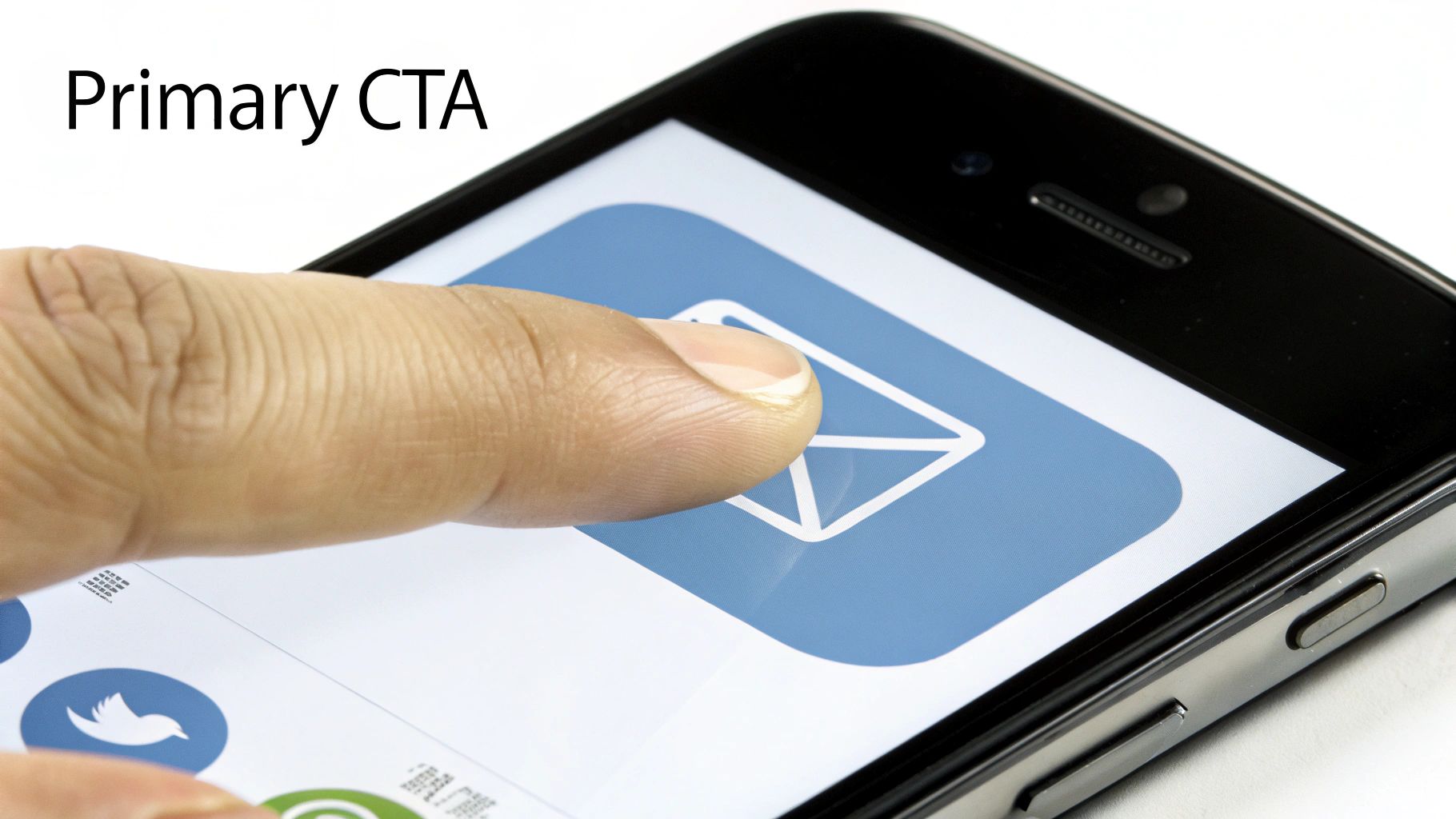
Real-world example: Netflix uses prominent, high-contrast "Watch Now" buttons that are impossible to miss. Slack’s clear "Join Workspace" CTA immediately directs new users to the core action. These examples show how a well-placed, unambiguous button can make or break an email's effectiveness.
Your Action Plan for Strategic CTA Placement
To maximize clicks, your CTA must be visible, compelling, and easy to use. This involves a thoughtful approach to its design, copy, and position.
- Step 1: Use Action-Oriented Language. Avoid passive words. Use strong verbs like "Get Started," "Discover Now," or "Shop the Collection" to create a sense of urgency and clarity.
- Step 2: Stick to One Primary CTA. To avoid decision paralysis, focus on one main goal per email. If you must include secondary options, make them visually distinct and less prominent (e.g., a text link instead of a button).
- Step 3: Design for Touch. Make buttons at least 44-48 pixels tall. This size is large enough for easy tapping on mobile devices.
- Step 4: Leverage Whitespace. Surround your CTA with ample whitespace to make it stand out. This visual breathing room draws the eye directly to the button.
- Step 5: Ensure High Contrast. Your button color should contrast sharply with the background to meet accessibility standards (WCAG AA). This ensures users with visual impairments can easily see and interact with it.
By placing CTAs logically and making them impossible to ignore, you guide users effortlessly toward your conversion goals. For more on this, exploring conversion-centered design principles can offer deeper insights.
3. Optimize Your Subject Line and Preview Text
The subject line and its companion, the preview text (or preheader), are your email's first impression. Together, they are the most critical factors influencing open rates. An effective combination piques curiosity, conveys value, and compels the recipient to engage further.
This powerful duo works in tandem to tell a micro-story about your email's value. Real-world example: Grammarly drives engagement with a personalized subject line like "You have 3 writing reminders." This tells the user exactly what to expect and why it's relevant to them, a key component of modern email design best practices.
Your Action Plan for Subject Lines and Preview Text
Think of the preview text as the subject line's essential supporting act. It should add context, not repeat information.
- Step 1: Prioritize the First 45 Characters. Most mobile email clients display only the first 45-50 characters of a subject line. Place your most compelling information at the very beginning.
- Step 2: Make the Preheader Complementary. Your preview text should continue the thought started in the subject line. If the subject is "Your gift just arrived 🎁," the preheader could be "Find out what’s inside and how to use it." Avoid generic text like "View this email in your browser."
- Step 3: Be Specific and Benefit-Driven. Instead of "New Blog Post," try "5 Steps to Double Your Email ROI." Clearly state what the user will gain.
- Step 4: A/B Test Everything. Continuously test different approaches. Pit a question against a statement, try using emojis versus no emojis, or test personalized subject lines against more general ones to see what resonates with your audience.
Mastering this combination is a crucial step in improving your campaign performance. For more inspiration, explore a curated collection of effective email subject line examples.
4. Maintain Consistent Branding and Visual Hierarchy
Consistent branding in your emails is the bedrock of trust and recognition. It ensures every communication feels familiar by using your established colors, typography, and logo. This is paired with a strong visual hierarchy, which strategically arranges elements to guide the reader’s eye logically from the most important headline down to the call-to-action.

This combination transforms your email into a cohesive brand experience. Real-world example: Mailchimp’s emails are always infused with their signature playful personality and friendly design. This practice reassures subscribers they are interacting with the brand they know and trust.
Your Action Plan for Branding and Hierarchy
To effectively implement these email design best practices, start by creating a mini style guide for your emails. This ensures every team member produces on-brand content.
- Step 1: Establish a Clear Hierarchy. Use distinct heading levels (H1, H2, H3) and font weights to differentiate sections. Your primary message or offer should always be the most visually dominant element.
- Step 2: Use Web-Safe Fonts. Stick to universally supported fonts like Arial, Helvetica, and Georgia to ensure your text renders correctly for everyone. If using a custom brand font, have a web-safe fallback defined in your CSS.
- Step 3: Maintain Ample Whitespace. Aim for a design that is 40-60% whitespace. This negative space prevents a cluttered look and helps key elements like your CTA stand out.
- Step 4: Ensure Logo Accessibility. Always include descriptive alt text for your logo image (e.g., "Company Name Logo"). This is crucial for screen readers and for users who have images blocked.
5. Master Image Optimization and Alt Text
Images are crucial for visual appeal, but they can slow down email load times and create accessibility barriers if not handled correctly. Proper image optimization involves compressing file sizes without sacrificing quality and using descriptive alt text. This ensures your emails load quickly and remain understandable even when images are blocked.

This dual approach guarantees a better experience for all subscribers. Real-world example: Retail brand Etsy excels here, using detailed alt text for product images (alt="Handmade ceramic mug with blue glaze") so the email is still effective and shoppable without visuals.
Your Action Plan for Image Optimization
Your goal is to strike a balance between visual quality and performance. Integrating these steps into your workflow is key.
- Step 1: Compress Images Aggressively. Aim for file sizes under 50KB for most images. Use tools like TinyPNG or ImageOptim. Use JPGs for photographs and PNGs for graphics that require transparency.
- Step 2: Write Descriptive Alt Text. Your alt text should describe the image's content and function. For a product, describe the item; for a button that's an image, describe the action (e.g., "Shop the Fall Collection Now").
- Step 3: Set Explicit Dimensions. Always include
widthandheightattributes in your<img>tags. This prevents the email layout from breaking or jumping around while images load. - Step 4: Avoid Image-Only Emails. Never send an email that is one single image. These are frequently flagged as spam and are completely inaccessible to screen readers.
- Step 5: Test with Images Off. A critical step is to view your email in various clients with image blocking enabled. This will show you exactly what a significant portion of your audience will see first.
Many of the core principles for web visuals are directly transferable. For a more in-depth look, understanding the fundamentals of optimizing images for SEO provides valuable insights.
6. Create a Scannable Content Structure
Most subscribers don't read emails; they scan them. A scannable content structure uses clear sections, short paragraphs, and generous white space to guide the reader’s eye to the most important information. This approach respects the user's time, ensuring your key message is absorbed quickly.
This design philosophy prevents overwhelm and makes your content feel approachable. Real-world example: Project management tool Asana masters this, using bullet points for feature updates and spacious layouts that feel breathable and focused.
Your Action Plan for a Scannable Structure
To make your content easily digestible, you must be intentional with layout, typography, and spacing.
- Step 1: Keep Paragraphs and Lines Short. Aim for paragraphs no longer than three lines and a maximum line length of 50-60 characters. This prevents a "wall of text."
- Step 2: Embrace White Space. Use generous margins and padding around text blocks, images, and buttons. A line height of 1.5x the font size (e.g., 24px for a 16px font) significantly boosts readability.
- Step 3: Use Visual Hierarchy. Employ headings, subheadings, and bolded keywords to create clear entry points for scanners. This allows them to quickly identify relevant sections.
- Step 4: Leverage Lists. Convert dense sentences into bulleted or numbered lists. This breaks up text and presents information in a highly scannable format.
By prioritizing scannability, you cater to modern reading habits and ensure your message lands with maximum impact. To learn more about how visual organization influences user perception, explore the principles of visual hierarchy in UX design.
7. Leverage Personalization and Segmentation
Moving beyond a one-size-fits-all approach, personalization and segmentation are critical for creating emails that resonate. This strategy involves tailoring content to specific audience segments based on their behavior, preferences, and demographics. This transforms a generic broadcast into a relevant, one-to-one conversation.
This method ensures your message is not just seen but felt. Real-world example: Spotify’s "Discover Weekly" emails are a prime example of using behavioral data (listening history) to deliver highly personalized value that users look forward to receiving.
Your Action Plan for Personalization
To successfully leverage this strategy, you need clean data and a clear understanding of your audience. Start small and expand your efforts.
- Step 1: Start with Simple Personalization. Begin by using merge tags to include the recipient's first name in the subject line or greeting (e.g., "Hey, Sarah...").
- Step 2: Segment Your Audience. Group your subscribers based on meaningful criteria. Common segments include purchase history (new vs. repeat customers), engagement level (active vs. inactive), and geographic location.
- Step 3: Utilize Dynamic Content. Design email blocks that display different content based on the recipient's segment. For example, show different product recommendations to customers in different lifecycle stages.
- Step 4: Leverage Behavioral Triggers. Set up automated emails based on user actions, such as abandoned cart reminders or welcome series for new sign-ups.
By tailoring your design and content, you make subscribers feel understood and valued. For those looking to dive deeper, HubSpot offers a comprehensive guide on how to segment an email list.
8. Build with Accessible and Semantic HTML
Building an email with accessible HTML is critical for creating inclusive campaigns. This approach involves using HTML code that provides meaning and structure, ensuring your message is understandable to everyone, including those who rely on screen readers. A well-structured email not only improves user experience but can also enhance deliverability.
This method goes beyond just visual design, focusing on the underlying framework. Useful Tool: The WAVE Web Accessibility Evaluation Tool can help you identify accessibility errors in your HTML before you send.
Your Action Plan for Accessible HTML
Adopting semantic HTML is about choosing the right tag for the right job, which provides context for browsers and assistive technologies.
- Step 1: Use Proper Heading Hierarchy. Structure your content logically with
<h1>for the main title, followed by<h2>,<h3>, etc. Never skip heading levels, as screen readers use them to navigate. - Step 2: Prioritize Color Contrast. Ensure your text has a minimum contrast ratio of 4.5:1 against its background. Use a contrast checker tool to verify your color choices.
- Step 3: Always Include Alt Text. Every functional image needs descriptive alt text (
alt="..."). For purely decorative images, use an empty alt attribute (alt="") so screen readers skip them. - Step 4: Define the Language. Set the language of your email by adding the
lang="en"attribute to your<html>tag. This helps screen readers pronounce the content correctly. - Step 5: Test with Screen Readers. Use tools like NVDA (free) or JAWS to experience your email as a visually impaired user would. This is the best way to uncover accessibility issues.
For those looking to audit and improve their current emails, tools from platforms like Dyno Mapper can provide comprehensive insights.
9. Test Across All Email Clients and Devices
Even the most beautiful email is useless if it breaks in your subscriber's inbox. Comprehensive testing across diverse email clients and devices is a non-negotiable step. Due to the vast differences in how clients like Gmail, Outlook, and Apple Mail render HTML, skipping this step is a major risk.
This rigorous validation prevents broken layouts and dysfunctional links that frustrate users. Useful Tool: Platforms like Litmus and Email on Acid specialize in this, offering previews across dozens of clients and devices in minutes, saving you from manual checks.
Your Action Plan for Comprehensive Testing
Build a pre-flight checklist that covers all potential rendering and functionality issues before you hit send.
- Step 1: Prioritize Major Clients. At a minimum, test your email on the latest versions of Gmail, Apple Mail, and Outlook. Use your own audience data to expand this list.
- Step 2: Check Dark Mode Rendering. With dark mode adoption soaring, verifying that your email is legible and on-brand in this setting is crucial. Pay attention to logos and color contrast.
- Step 3: Test on Real iOS and Android Devices. A final review on actual mobile devices is essential to catch touch-target issues and OS-specific rendering quirks.
- Step 4: Verify All Links. Click every single link in your email to ensure it directs to the correct URL. This includes social media icons and the unsubscribe link.
Thorough testing is a cornerstone of professional email design best practices and plays a role in sender reputation. To understand the connection, explore our guide on how to improve email deliverability.
10. Design a Compliant and Helpful Footer
An email footer is more than just the end of your message; it’s a critical component for legal compliance and user trust. A well-designed footer provides essential information that empowers subscribers, such as an unsubscribe link and company details, which are legally required by regulations like CAN-SPAM and GDPR.
This section reinforces transparency and gives subscribers control. Real-world example: Brands like HubSpot and Slack provide clear, uncluttered footers with easily accessible unsubscribe links and preference centers, proving that compliance and good design go hand-in-hand.
Your Action Plan for an Effective Footer
A great footer is clean, functional, and legally sound. The goal is to provide necessary information without creating a cluttered visual experience.
- Step 1: Make the Unsubscribe Link Obvious. Your unsubscribe link must be prominent and easy to find. Hiding it leads to frustration and spam complaints. A one-click unsubscribe is the gold standard.
- Step 2: Include Your Physical Address. The U.S. CAN-SPAM Act legally requires you to include a valid, physical postal address of your business.
- Step 3: Keep it Simple and Legible. Use a slightly smaller but still readable font size (around 11-12px). A subtle horizontal line can effectively separate the footer from the main email body.
- Step 4: Provide Contact Information. Add links to your contact page or social media icons. This builds trust and offers alternative engagement channels.
For a comprehensive overview of legal requirements, reviewing the FTC’s CAN-SPAM Act Compliance Guide is an excellent next step.
10-Point Email Design Best Practices Comparison
| Item | 🔄 Implementation Complexity | ⚡ Resource Requirements | 📊 Expected Outcomes | 💡 Ideal Use Cases | ⭐ Key Advantages |
|---|---|---|---|---|---|
| Mobile-First Responsive Design | High — requires media queries, responsive layouts and fallbacks 🔄 | Moderate — dev time, responsive assets and device testing ⚡ | Better mobile UX, higher mobile CTR, lower bounce rates 📊 | Transactional and marketing emails where >50% opens are mobile 💡 | ⭐⭐⭐⭐ Future-proof; stronger mobile engagement |
| Clear Call-to-Action (CTA) Placement | Low–Moderate — layout and copy focus; A/B testing needed 🔄 | Low — button assets, simple dev and testing ⚡ | Higher conversions and clearer user flow 📊 | Promotional sends, onboarding, conversion-focused emails 💡 | ⭐⭐⭐⭐ Direct, measurable impact on click rates |
| Optimal Preview Text and Subject Line | Low — copy constraints and platform differences 🔄 | Low — copywriting and A/B test resources ⚡ | Increased open rates; reduced spam placement 📊 | Acquisition, newsletters, time-sensitive campaigns 💡 | ⭐⭐⭐⭐ Strong influence on open behavior |
| Consistent Branding and Visual Hierarchy | Moderate — style guides, typography and layout control 🔄 | Moderate — design assets, governance and testing ⚡ | Improved recognition, trust and scannability 📊 | Brand-awareness campaigns and corporate communications 💡 | ⭐⭐⭐⭐ Builds trust and consistent brand perception |
| Image Optimization and Alt Text | Low–Moderate — compression workflow and alt-text discipline 🔄 | Low — optimization tools and editing time ⚡ | Faster load times, better accessibility and rendering 📊 | Product emails, image-heavy newsletters, catalogs 💡 | ⭐⭐⭐ Better performance and accessibility |
| Scannable Content Structure and White Space | Low — content editing and layout discipline 🔄 | Low — copy strategy and minor design adjustments ⚡ | Higher comprehension, engagement and CTRs 📊 | Updates, digests, long-form newsletters and announcements 💡 | ⭐⭐⭐ Improves readability and user attention |
| Personalization and Segmentation | High — data infrastructure, segmentation logic and privacy 🔄 | High — CRM/ESP integration, analytics, dynamic content tooling ⚡ | Higher opens/clicks/conversions (notable lift) 📊 | Retention, recommendations, lifecycle and triggered emails 💡 | ⭐⭐⭐⭐⭐ Significant uplift in engagement and conversions |
| Accessible and Semantic HTML Structure | Moderate — accessibility standards and semantic markup 🔄 | Moderate — dev effort, accessibility testing tools ⚡ | Broader reach, compatibility, compliance and maintainability 📊 | Transactional, public-facing and regulated communications 💡 | ⭐⭐⭐ Improves inclusivity and deliverability |
| Testing Across Email Clients and Devices | High — many client quirks, dark mode and rendering scenarios 🔄 | High — testing platforms, real devices and QA time ⚡ | Fewer rendering issues; consistent recipient experience 📊 | High-volume sends, complex templates, diverse audiences 💡 | ⭐⭐⭐⭐ Ensures reliable cross-client rendering |
| Footer Design with Compliance Information | Low — legal content placement and link management 🔄 | Low — legal review and content maintenance ⚡ | Legal compliance, clearer opt-outs and increased trust 📊 | All commercial emails and regulated communications 💡 | ⭐⭐⭐ Ensures compliance and transparent user options |
Summary and Your Next Step
We've covered the ten foundational pillars of exceptional email creation, from the non-negotiable necessity of mobile-first design to the critical details of a compliant footer. Each principle is a vital component in a larger machine designed to build trust, drive engagement, and deliver tangible results.
The true power of these concepts emerges when they work in harmony. A great subject line earns the open, but it's a clear CTA and scannable layout that secure the click. The common thread is a deep respect for your subscriber's time and attention. By implementing these techniques, you are signaling that you value their experience.
The journey from learning to mastery is paved with consistent action. The goal isn't to overhaul your entire strategy overnight, but to make your next email better than your last.
Your Recommended Next Step: Choose just one of these best practices to implement in your very next email campaign. A great place to start is with Clear Call-to-Action (CTA) Placement. Review your current template and ask: "Is my main CTA button obvious, action-oriented, and easy to tap on a phone?" Making one small improvement here can yield immediate results.
Tired of wrestling with code to implement these best practices? EmailGum provides a library of professionally designed, fully responsive, and accessible email templates that have all these principles built right in. Get started in minutes and focus on your message, not your HTML, with a template from EmailGum.