An email marketing campaign template is a reusable, pre-built email layout. Think of it less as a fill-in-the-blanks document and more as a strategic blueprint that lets you create consistent, on-brand emails without starting from scratch every single time. It's the secret weapon for sending everything from flash sale announcements to your weekly newsletter, saving you time and boosting your results.
Why a Master Template Is Your Strongest Asset
Let's be practical. Building every single email from the ground up is a massive time sink. It might feel productive while you're nudging pixels and hunting for the right brand color, but those are hours stolen from what really matters: strategy, analyzing performance, and understanding your audience.
A master email marketing campaign template changes the game. It’s not just a shortcut; it's a foundational tool that drives consistency, efficiency, and growth.
Reinforce Your Brand Identity
Your brand is the promise you make to your customers. A master template is how you keep that promise visually consistent in every single email. Whether it's the first welcome message a new subscriber gets or a holiday promotion, it needs to look and feel distinctly yours. This is how you build trust and become a recognizable name in a chaotic inbox.
Think about the key elements a template locks in place:
- Logo Placement: Your logo is your calling card. A template ensures it's always in the same, optimal position, reinforcing recognition at a glance.
- Color Palette: A consistent color scheme for headings, links, and buttons makes your emails feel familiar and professional, not slapped together.
- Fonts and Typography: The right fonts communicate your brand's personality, and a template ensures they’re applied correctly every single time.
This unified approach makes your subscribers feel comfortable. They know who the email is from instantly, which can have a huge impact on open rates and engagement.
Industry Insight: A consistent brand presentation across all channels can increase revenue by up to 23%. Your email template is one of the most direct and powerful ways to maintain that consistency.
Guarantee a Flawless User Experience
Here's a stat that should get your attention: more than 50% of all emails are opened on a mobile device. If your email is a jumbled mess on a smartphone—stretched images, tiny text, broken columns—you’ve probably lost that subscriber for good.
A professionally built master template has responsive design baked into its DNA.
This means your layout automatically flexes and adapts to fit any screen, looking just as good on a tiny phone as it does on a huge desktop monitor. All your key components, from the header and footer to the CTA buttons, are pre-tested to render perfectly everywhere. This isn't just about looking good; it's about signaling professionalism and respecting your audience's time.
When you nail the user experience, you're also setting the stage for more effective retention marketing strategies. A great experience is what keeps people coming back.
Plus, with a solid layout in place, you can focus on more advanced tactics. For example, you can dive into our guide on what is email segmentation to learn how to send highly tailored messages, confident that your master template will deliver that content flawlessly every time.
Anatomy of a High-Converting Email Template
Alright, let's move from theory to action. A high-converting email isn't just a random assortment of text and images; it's a meticulously crafted journey. Every single piece, from the header all the way down to the footer, has a critical role to play in guiding a subscriber from opening the email to taking action.
I like to think of it like building with LEGOs. You have different blocks—a header block, a text block, an image block—and your job is to assemble them into a structure that's clear, compelling, and easy to follow. When you get it right, the result is a seamless experience that feels both intuitive and persuasive.
Here's a step-by-step breakdown of the essential components every master template should have. Think of this as your blueprint for building emails that not only look great but also perform exceptionally well.
Essential Components of a Reusable Email Template
| Component | Purpose | Best Practice Example |
|---|---|---|
| Header | Establishes brand identity and provides essential navigation. | Your logo on the left, with 2-3 key links like "Shop" or "New Arrivals" on the right. |
| Hero Image | Captures immediate attention and visually communicates the email's core message. | A high-quality, on-brand lifestyle photo featuring your new product. |
| Headline & Body Copy | Delivers the main message and value proposition. | A clear, benefit-driven headline followed by concise, scannable paragraphs. |
| Call to Action (CTA) | The primary conversion point; guides the user toward the desired action. | A brightly colored, high-contrast button with action-oriented text like "Get 20% Off Now". |
| Whitespace | Improves readability and reduces visual clutter. | Generous padding around all text blocks, images, and buttons to create breathing room. |
| Social Proof | Builds trust and credibility. | A small section with a 5-star customer review or logos of publications you've been featured in. |
| Footer | Provides legal compliance, contact info, and secondary navigation. | Unsubscribe link, physical address, and links to your social media profiles. |
With this structure in mind, you can create a flexible yet consistent framework for any campaign you need to run, from promotions to newsletters.
Crafting a Strategic Header
The header is your email's first impression. It sets the tone and instantly tells subscribers who the message is from. This is no place for clutter. Your goals here are simplicity and immediate brand recognition.
Always place your logo prominently—left-aligned or centered usually works best. It reinforces your brand without overwhelming the reader. You might also consider a minimalist navigation bar, but don't try to replicate your entire website menu. Just stick to two or three essential links, like "Shop," "New Arrivals," or "Blog."
Real-World Example: Take a brand like Headspace. They often use a super clean header with just their logo, immediately grounding you in their familiar, calming brand experience. This minimalist approach works because it lets the reader's focus drop right down to the main message.
Structuring the Body for Readability
This is where the magic happens. The body holds your core message and your all-important call to action. How you organize this content will make or break whether your email gets read or immediately trashed. The number one rule? Design for mobile first.
A single-column layout is non-negotiable in modern email. It guarantees your content will stack vertically and stay perfectly readable on any screen size. No one wants to do that annoying "pinch and zoom" dance—it’s a one-way ticket to losing engagement. This layout naturally guides the eye down the page, straight toward your CTA.
Just as critical is whitespace, the negative space around your text and images. Don't be afraid of it! Good use of whitespace prevents your email from feeling cramped and overwhelming. It gives your content room to breathe, makes it easier to read, and helps your most important elements pop.
Your email template isn't just a container for content; it's a strategic framework that directs attention. A single-column layout combined with generous whitespace is the most effective way to create a clear, focused path to conversion, especially on mobile devices.
The data backs this up. According to industry reports, the average click-to-open rate (CTOR), which measures clicks against opens, is about 10.5%. This metric is fantastic for judging how relevant and engaging your email's content and layout are. If you want to dive into more numbers, you can explore the latest email marketing statistics.
Designing a Compelling Call to Action
Your Call to Action (CTA) is the hero of your email. It's the moment of truth where you ask your subscriber to do something. The design and copy of your CTA button can single-handedly determine your campaign's success.
First, your CTA button needs to be visually distinct. Use a contrasting color that stands out from the background but still fits within your brand's color palette. Real-World Example: Trello nails this by using a vibrant blue for its CTAs that really pops against its usual white or muted backgrounds.
The words on the button are just as crucial. Ditch generic phrases like "Click Here" or "Submit." Instead, use action-oriented and benefit-driven copy that tells people exactly what they're going to get.
Here are a few actionable swaps that make a huge difference:
- Instead of "Shop Now" -> "Shop the New Collection"
- Instead of "Download" -> "Get My Free Guide"
- Instead of "Sign Up" -> "Start My 30-Day Trial"
Building a Trustworthy Footer
Last but not least, the footer. It might not be the sexiest part of your email, but it serves a vital legal and functional purpose. A well-designed footer builds trust and keeps you compliant with anti-spam laws like CAN-SPAM.
This section needs to be clean, organized, and easy to read. It's your chance to wrap things up professionally and maintain your deliverability.
Your footer must always include:
- Unsubscribe Link: Make this clear and easy to find. Hiding it only frustrates users and leads to spam complaints, which will tank your sender reputation.
- Physical Mailing Address: This is required by law in many countries and proves you're a legitimate business.
- Social Media Links: Give subscribers another way to connect with your brand outside of their inbox.
- Reason for Contact: A simple reminder like, "You're receiving this email because you opted in on our website," can cut down on unsubscribes and spam reports.
By putting these core components together—a clean header, a readable body, a compelling CTA, and a trustworthy footer—you'll have a powerful, reusable email template that's built to drive results.
Writing Subject Lines That Get Opened
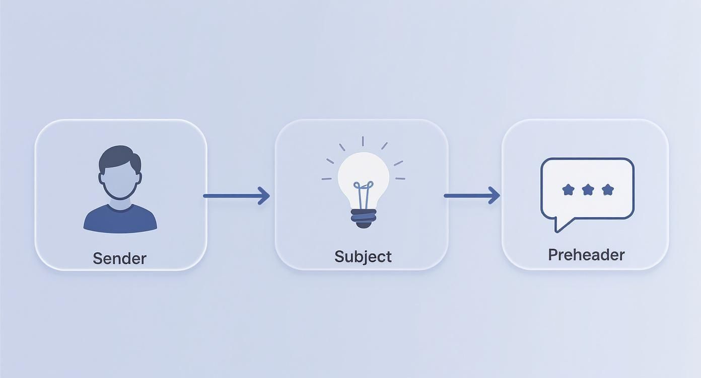
Let's be honest: a stunning email template is useless if nobody opens it. Before anyone can admire your design work, they first have to get past the gatekeepers of the inbox: the subject line, the preheader, and the sender name.
Think of these three elements as your email's first impression, working together to earn that all-important click in a sea of other emails. A weak subject line means all the effort you poured into the template's content and design goes to waste.
The Power Trio of the Inbox
Before we get into specific formulas, you need to understand how these three pieces play off each other. They're a team, not solo acts.
- Sender Name: This is your identity. It must be instantly recognizable. For most companies, this is simply your brand name (e.g., "EmailGum"). If you're a creator or consultant, a personal touch can work wonders (e.g., "Jane from EmailGum").
- Subject Line: This is your hook. It’s the main reason someone will open your email. It needs to be compelling, especially since nearly 47% of people decide whether to open an email based on the subject line alone.
- Preheader Text: This is your secret weapon. It’s the snippet of text that trails the subject line, giving you a second chance to add context or create intrigue. Never let this default to "View this email in your browser." That's a massive wasted opportunity.
When they work in harmony, the effect is powerful. A sender name they trust, a subject line that sparks curiosity, and a preheader that seals the deal. That's the combination that gets you opened.
Formulas for High-Performing Subject Lines
You don't have to reinvent the wheel every time. Leaning on proven formulas helps you craft effective copy fast. The key is to always frame it from the subscriber's point of view: What’s in it for me?
Here are a few battle-tested formulas you can adapt right away:
The Curiosity Gap: Hint at something compelling without giving away the whole story. This creates a psychological tension that your reader can only relieve by clicking.
- Real-World Example: "The one mistake everyone makes..." or "We weren't expecting this to happen."
Urgency and Scarcity: This is a classic for a reason—it works. Highlighting a limited time or quantity pushes people to act now. Just be sure to use it honestly, or you'll burn out your audience.
- Real-World Example: "Last chance for 40% off your favorites" or "Just a few left... don't miss out."
The Direct Benefit: Just tell them what they're going to get. It’s straightforward, honest, and incredibly effective because it respects their time.
- Real-World Example: "Your guide to writing better emails is here" or "Save an hour every week with this tip."
If you're ever stuck, we've got you covered. Check out our massive list of powerful email subject line examples that you can adapt for any campaign.
Go Beyond the First Name with True Personalization
Personalization has to be more than just dropping {{first_name}} into the subject line. Today's best email marketing uses real customer data to create a message that feels like it was written for one person. This is where a well-designed template really shines, with spots ready for dynamic content.
True personalization is about relevance at scale. It’s using what you know about a subscriber—their behavior, preferences, and history—to send an email that feels crafted just for them.
Think about the data you're already collecting. You can create incredibly effective, personalized subject lines based on:
- Recent Purchase History: "How are you enjoying your [Product Name]?"
- Browsing Behavior: "Still thinking about those hiking boots?"
- Location: "Heads up, Austin! Our pop-up is this weekend."
- Loyalty Status: "A special offer just for our VIP members"
This isn't just clever marketing; it shows you're paying attention. It turns a generic blast into a helpful, one-on-one conversation, which is exactly what drives opens and builds relationships.
Putting Your Template to Work with Automation
A perfectly designed email template is a fantastic asset, but it truly starts working for you when you connect it to marketing automation. This is the magic step where your beautiful design transforms from a static file into a 24/7 revenue engine.
With the right automated workflows, you can nurture leads, recover lost sales, and keep subscribers engaged around the clock—all without lifting a finger.
This isn’t just about saving time; it's about delivering the right message at the exact moment it’s most relevant. That timeliness leads to some incredible results. Automated emails can achieve 52% higher open rates and 332% higher click rates compared to standard scheduled campaigns. If you want to dive deeper, Omnisend has a great breakdown of these stats.
What's driving those numbers? Context. Highly relevant messages like welcome emails and abandoned cart reminders are the heavy lifters, accounting for a massive 87% of all orders generated through automation.
Let's walk through how to set up the most critical automated series using your new template.
The Multi-Touch Welcome Sequence
Your welcome sequence is your best shot at making a great first impression. The moment a new subscriber signs up, their interest is at an all-time high. A single welcome email is okay, but a multi-email series is how you build a real relationship and guide them toward their first purchase.
The goal is to introduce your brand, set expectations, and provide immediate value. A solid welcome series usually runs for three to five emails over the first week.
Here’s a practical, step-by-step blueprint for a three-part welcome flow:
- Email 1 (Sent Immediately): Deliver the goods. If you promised a discount code, a free guide, or exclusive content, give it to them right away. Keep this email laser-focused with a clear CTA like "Use Your Code" or "Download Now."
- Email 2 (Sent 1-2 Days Later): Tell your story. This is your chance to share what makes you different. Talk about your mission, introduce the founder, or highlight your core values. This is how you build a connection that goes beyond a simple transaction.
- Email 3 (Sent 3-4 Days Later): Show them what's popular. Feature your best-selling products, glowing customer testimonials, or links to your most-loved blog posts. This helps new subscribers see what other people love about your brand and gives them a clear next step.
Your welcome series shouldn't just be a sales pitch. Think of it as an onboarding process. You're not just welcoming them to a list; you're welcoming them into your brand's community.
The Cart Abandonment Campaign
Cart abandonment is part of doing business online, but it’s also a massive opportunity. When someone adds an item to their cart, they’re signaling serious buying intent. A timely, automated reminder is often the only nudge they need to finish checking out.
A successful cart recovery sequence is all about timing and knocking down any last-minute objections. You have to act fast while the purchase is still fresh in their mind.
Getting this right starts before they even open the email. The sender name, subject line, and preheader are your first line of attack in a crowded inbox.
These three elements act as the gatekeepers to your content, so they're absolutely critical for time-sensitive automations like this one.
A simple but highly effective two-email flow can work wonders here:
- Email 1 (Sent 1-4 Hours After Abandonment): This is a gentle reminder. The tone should be helpful, not pushy. Try a subject line like, "Did you forget something?" and make sure to display the items they left behind with a direct link back to their cart.
- Email 2 (Sent 24 Hours Later): If they still haven't bought, it's time to add urgency or address potential barriers. You could offer a small discount (10% off is a common incentive), remind them about your free shipping policy, or show customer reviews for the abandoned items to build their confidence.
The Re-Engagement Flow
It's natural for some subscribers to lose interest over time. A re-engagement campaign, often called a "win-back" series, is your chance to reignite their interest before you have to remove them from your list for good.
The whole point is to remind them why they signed up in the first place. Using your template, you can set up a targeted series for anyone who hasn't opened or clicked an email in a specific timeframe, like 90 or 120 days.
Here’s a simple re-engagement workflow:
- Email 1: Kick things off with an attention-grabbing subject line like "Is this goodbye?" or "We miss you." Remind them of the value you offer, whether it's expert tips, exclusive deals, or just great content.
- Email 2: Bring out a strong offer. This is your last real shot to win them back, so make it count. Offer an exclusive discount or a special freebie with their next purchase.
- Final Email: Let them know you'll be removing them from your list if they don't take action. Frame it politely: "We want to make sure we're only sending emails to people who want them. Click here to stay subscribed." This respects their inbox and helps you maintain good list hygiene.
By putting these core automations in place, your email template becomes a powerful, proactive tool that works for you 24/7, turning subscriber actions into real business results.
Optimizing for Deliverability and Accessibility
You've built a killer email template. That’s a huge win, but the job isn't quite done. An email campaign is only successful if it actually lands in the inbox and everyone on your list can easily read it. This is where two critical concepts come into play: deliverability and accessibility.
Think of it this way: deliverability gets your email through the front door. Accessibility ensures it's a welcome guest once it's inside. If you neglect either one, all that hard work on design and copy could go to waste.
Building for Every Screen with Responsive Design
The inbox isn't just one place anymore—it’s a collection of screens, from massive desktop monitors to the phone in your pocket. Your template absolutely must provide a seamless experience on every single device. This is why a responsive-first approach isn't optional; it's essential.
Responsive design means your layout automatically adjusts to the screen size. Images scale down, columns stack neatly, and text reflows so nobody has to pinch and zoom. Most modern email builders handle the heavy lifting here, but it’s still on you to test everything before you launch.
A bad mobile experience is a dealbreaker. Over 42% of users will just delete an email if it doesn’t display correctly on their phone. Your template has to be built to avoid that fate.
Designing for Accessibility
Accessibility means making sure everyone can engage with your emails, including people with disabilities who might use assistive tech like screen readers. This isn't just about being inclusive—it's about expanding your reach and making sure your message connects with your entire audience.
Here are a few actionable habits to build into your template design:
- Descriptive Alt Text: Every image needs alternative text (alt text) that clearly describes what it shows. This is what screen readers use to convey visual information to users who can't see the images.
- Sufficient Color Contrast: Make sure your text color stands out clearly from your background color. Low contrast is a huge barrier for visually impaired readers. Tools like the WebAIM Contrast Checker can tell you if your color choices pass the test.
- Logical HTML Structure: Use proper heading tags (H1, H2, H3) to give your content a clear, logical hierarchy. This makes it much easier for screen reader users to navigate through the email and find what they need.
Mastering the Fundamentals of Deliverability
Deliverability is the art and science of getting your emails into the primary inbox instead of the spam folder. Internet Service Providers (ISPs) like Gmail and Outlook are constantly judging your sender reputation to decide where your messages should go. A clean template and smart sending practices are your best tools for building their trust.
A great place to start is by regularly cleaning your email list to remove inactive subscribers and invalid addresses. To keep your list healthy, it's also a good idea to learn how to merge duplicate contacts. For a deeper dive, check out our complete guide to email deliverability best practices.
Next, you'll want to set up authentication protocols like SPF (Sender Policy Framework) and DKIM (DomainKeys Identified Mail). These act like a digital signature, proving to ISPs that you are who you claim to be and protecting your domain from being used in phishing scams.
Finally, watch your content. Avoid spammy trigger words like "free" or "act now," and don't overuse punctuation or all caps—these are classic red flags for spam filters.
Common Questions About Email Templates
Even with a solid plan, questions always pop up. Here are answers to some of the most common questions marketers have when creating and managing their email templates.
What Are the Best Tools for Building a Template?
This really comes down to your team's technical skills and budget. The good news is you don’t need to be a coding expert to create a professional, responsive template.
- Email Service Providers (ESPs): Most of the time, the best tool is the one you already have. Platforms like Mailchimp, ConvertKit, or Klaviyo have fantastic drag-and-drop editors. These are my top recommendation for most people because they're intuitive, guarantee responsiveness, and are already integrated with your sending platform.
- Dedicated Template Builders: If you need more design flexibility or want to use the same template across different ESPs, tools like Stripo or BeeFree are brilliant. They offer advanced design options and make it easy to export your HTML.
- Hand-Coding: For those with the skills, coding a template from scratch in HTML and CSS gives you total control. Just be warned: this route requires extensive testing across every email client imaginable to ensure it doesn't break.
How Often Should I Update My Master Template?
Think of your master template as a living document, not a "set it and forget it" file. A good rule of thumb is to give it a thorough review every 6-12 months.
You should also revisit it anytime you go through a major brand refresh.
A regular check-in ensures your template stays aligned with your current branding, incorporates the latest accessibility best practices, and looks sharp on new devices. It's also the perfect time to review your campaign performance and see if a few design tweaks could improve your click-through rates.
Your template isn't static. Small, iterative updates based on performance data and new design trends will keep your email marketing sharp and effective for the long haul.
How Can I A/B Test My Template Effectively?
A/B testing is how you optimize your template for better results. The key is to test one variable at a time so you can clearly attribute any change in performance.
A great place to start is with your call-to-action (CTA) button. You could test a bold, high-contrast color against a more subtle, on-brand color to see which one grabs more clicks. Or, try testing different copy—something action-oriented like "Shop the Collection" versus a simpler "Shop Now."
By isolating just one change, you can confidently attribute any difference in performance to that specific element. That’s how you make data-backed improvements that actually move the needle.
Summary and Your Next Step
Creating a master email marketing campaign template is a strategic investment. It saves time, ensures brand consistency, guarantees a great user experience, and provides a powerful foundation for all your automated campaigns. By focusing on a clean structure, compelling calls to action, and mobile-first design, you can build a reusable asset that drives results for years to come.
Recommended Next Step: Open your email marketing platform and review your existing template. Using the checklist from the "Anatomy of a High-Converting Email Template" section, identify one element—like your CTA button color or footer information—that you can improve today.
Ready to build campaigns that get results? EmailGum provides the expert guides and practical tutorials you need to master every aspect of email marketing. Start learning for free at EmailGum.