
It’s tempting to jump straight into a drag-and-drop builder and start designing. But creating an email template that actually works—one that you can reuse for every campaign—starts long before you touch any software.
This initial planning is your foundation. It’s what separates a beautiful but ineffective email from a reliable, high-performing asset that saves you time and drives results. Let's walk through how to build one step-by-step.
Why You Need a Plan Before You Build
Skipping the planning phase leads to templates that feel disconnected from your brand, fail to guide the reader, and need constant edits. It’s a massive time sink.
A little strategic thinking upfront changes everything. This isn't about creating pixel-perfect mockups; it's about making a few key decisions that define the template's purpose and structure. That investment pays off, making the design and build process faster and more focused.
Step 1: Define a Single, Powerful Goal
Every email you send should have one primary job. Just one.
Are you trying to drive sales for a new product? Announce company news? Get sign-ups for a webinar? Whatever it is, that single goal is the North Star for your entire template design.
For example, a sales email for a new product should have a call-to-action (CTA) button as the undeniable hero. The headline, images, and copy must all funnel the reader's eye directly to that "Shop Now" button.
But for a newsletter sharing a new article, the headline and an engaging intro paragraph become the main event, with a clear "Read More" link. Trying to cram too much into one email just creates confusion and tanks your click-through rate.
Actionable Takeaway: A template designed to do everything will accomplish nothing. Before you build, decide on the one core action you want subscribers to take. Build the entire visual experience around that singular goal.
Step 2: Establish a Strong Visual Hierarchy
Visual hierarchy is simply how you arrange elements to show what’s most important. It's how you tell the reader, "Look here first, then here, then here." A strong hierarchy ensures your most critical information—like the main benefit and the CTA—gets noticed instantly.
You can create this visual flow with a few simple design principles:
- Size and Scale: Make your main headline significantly bigger than your body text. Your CTA button should also be large and impossible to miss.
- Color and Contrast: Use a bold, on-brand color for your CTA to make it pop. Reserve your brightest, most eye-catching colors for the elements that demand attention.
- Whitespace: Don't underestimate the power of empty space. Generous spacing around your logo, headlines, or CTA makes them stand out and gives the design a clean, professional feel.
Think of it like a retail display where star products are placed at eye level. In your email, the main message and CTA should be just as obvious. A clear hierarchy is non-negotiable for writing effective emails that convert.
Step 3: Create a Modular Design System
The best email templates aren't rigid designs. They're flexible systems built from reusable components, or "blocks." This is the secret to moving fast while keeping your brand looking sharp and consistent.
Imagine having a library of pre-designed, pre-approved blocks for common content needs:
- A header with your logo and navigation.
- An introductory text block.
- A product feature block (e.g., image on left, text on right, button below).
- A simple text-only announcement block.
- A footer with social links and compliance information.
With these modules ready to go, you can assemble a promotional email, a newsletter, or a transactional receipt just by stacking the blocks you need. This saves an incredible amount of time and ensures every email feels intentional. You can adapt to any campaign without starting from scratch.
Once you’ve got a solid plan, the next step is bringing it to life with a design that works for everyone. A great design isn't just about looking good—it must function flawlessly on every device. This is where you bridge the gap between strategy and execution, creating an experience that invites every subscriber to engage.
It all starts with thinking small. Specifically, a small screen. With over half of all emails opened on mobile, designing for a phone isn't an afterthought; it's the starting point. When you build for mobile first, you're forced to prioritize, keeping your message clean, focused, and free of clutter.
The single-column layout is your best friend here. It’s the simplest way to ensure your content stacks neatly and logically on any screen, saving readers from the dreaded pinch-and-zoom dance. This straightforward structure is the backbone of most high-performing email templates today.
Step 4: Prioritize a Mobile-First Approach
Adopting a mobile-first philosophy means you build for the most constrained environment first, then expand the design for larger screens like tablets and desktops. This approach naturally produces cleaner, more effective templates that load fast and are easy to navigate with a thumb.
The data confirms this strategy works. Responsive email templates can boost unique mobile clicks by 15%. Considering Apple holds a staggering 51.52% market share among email clients, making sure your template looks perfect on an iPhone is non-negotiable.
Here’s a practical checklist for mobile-first design:
- Make CTAs Tappable: Your call-to-action buttons need to be big enough for a thumb. Aim for at least 44x44 pixels to prevent frustrating mis-taps.
- Embrace Whitespace: Generous spacing around text, images, and buttons is crucial. It gives your content room to breathe and improves readability on small screens.
- Keep Your Copy Tight: Mobile users are scanners. Write short, punchy headlines and brief paragraphs. Get straight to the point.
Step 5: Make Your Design Accessible to All
Accessibility isn’t just a technical requirement; it’s about ensuring every person on your list can understand your message, including subscribers with visual impairments who rely on screen readers. An accessible email is an inclusive email, which builds trust and often leads to better engagement across your entire audience.
Think of it as simply being a good host. When someone using assistive technology can navigate your content with ease, you’re not just following best practices—you’re building trust and showing respect.
Expert Insight: An accessible design is usually just a better design for everyone. High-contrast colors are easier for all users to read, and clean, readable fonts reduce eye strain for your whole audience.
A few accessibility practices are non-negotiable:
- Use High-Contrast Colors: Use a free contrast checker tool to ensure your text is legible against its background. The goal is a contrast ratio of at least 4.5:1 for standard body text.
- Choose Readable Fonts: Stick with simple, web-safe fonts like Arial, Helvetica, or Georgia. For body copy, a font size of at least 16px is a great starting point.
- Write Descriptive Alt Text: Every image that conveys information needs alt text—a short description that screen readers can announce. For purely decorative images, use an empty alt tag (
alt="") so screen readers know to skip them.
Image optimization is another key piece of the puzzle, crucial for both fast load times and accessibility. For a deeper dive, check out this excellent guide on image optimization for web performance.
Finally, use proper semantic HTML tags (like <p> for paragraphs and <h1> for headings) to help screen readers interpret your email's structure. This principle applies right down to your footer, which must be clear and compliant. Learn more in our guide on how to create an effective email footer.
Drag-and-Drop vs. Custom HTML: Which Way Should You Go?
With a solid design plan, you’re ready to build. Now you have a choice: use a visual drag-and-drop editor or code the template with custom HTML?
There’s no single "right" answer. The best path depends on your team's skills, your tools, and how much control you need over the final product.
The Speed and Simplicity of Drag-and-Drop Editors
For most marketers, drag-and-drop builders are the clear winners. Platforms like Mailchimp, HubSpot, and Beehiiv make it simple to create beautiful, responsive email templates without writing code. The process is intuitive: you pull in pre-built blocks for text, images, and buttons, then arrange them to bring your design to life.
This approach comes with major perks:
- It's incredibly fast. You can create a professional template in minutes, not days.
- Responsiveness is built in. The platform handles the complex code to ensure your email looks great on desktops and mobile devices.
- No coding skills are needed. This empowers your entire team to create and edit campaigns without waiting on a developer.
For example, a small e-commerce business using a drag-and-drop editor can quickly clone their newsletter template, drop in new content, and send it out. They customize existing modules, which is perfect for maintaining speed and brand consistency.
The trade-off is control. While you can customize colors, fonts, and spacing, you might struggle to create a truly unique layout that perfectly matches a complex brand vision.
Embracing Total Control with Custom HTML
For teams that need pixel-perfect control, custom HTML is the only way to go. Building a template from scratch lets you create a completely bespoke design. However, this path requires deep expertise and a painful understanding of how different email clients render code.
Email HTML is notoriously tricky—it's nothing like modern web development. You're often stuck with archaic standards, using tables for layouts and writing inline CSS to prevent your design from falling apart in clients like Microsoft Outlook. And that's a big deal, considering a reported 1.4 billion people globally use Outlook, and its rendering engine can be unforgiving.
Expert Tip: If you're coding an email, always test for the "Outlook problem." What looks pristine in Gmail or Apple Mail can become a jumbled mess in Outlook. Using tools like Litmus or Email on Acid to test your code across dozens of clients isn't a luxury; it's an essential sanity check.
Here’s a quick look at how the two methods stack up:
| Aspect | Drag-and-Drop Editors | Custom HTML |
|---|---|---|
| Speed | Blazing Fast | Slow & Methodical |
| Skill Level | Beginner-Friendly | Requires Expert Knowledge |
| Flexibility | Limited to Platform Features | Complete Creative Control |
| Consistency | High (handles rendering) | Varies (requires extensive testing) |
If you decide to dive into custom code, you'll need to write clean, table-based HTML. Here’s a basic snippet for a responsive, tappable call-to-action button that's built to withstand even the most difficult email clients.
| Shop Now |
This decision tree can help you visualize the right path for maintaining your template's design integrity.
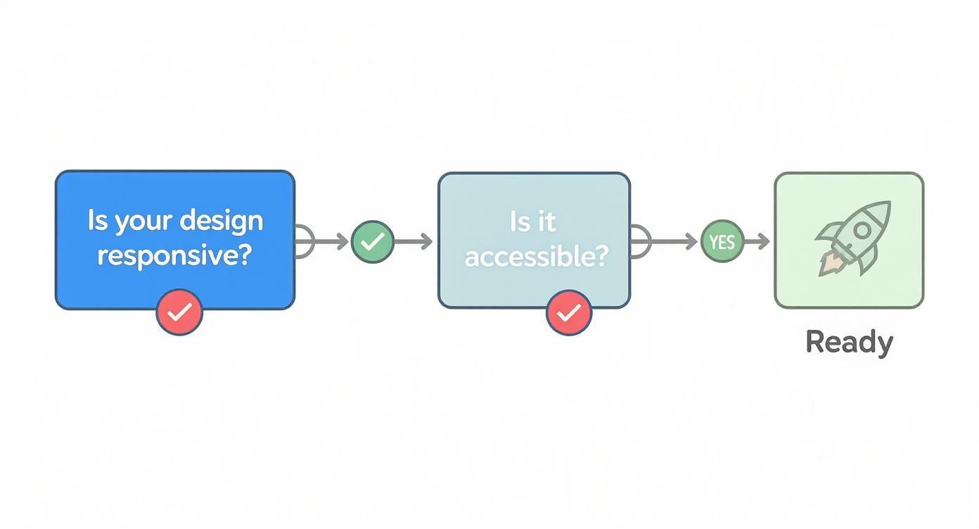
As you can see, core principles like responsiveness and accessibility are non-negotiable checkpoints, no matter which build method you choose.
Ultimately, pick the method that lets your team work efficiently without sacrificing quality. For most teams, a drag-and-drop editor is the smart, practical choice. For brands with dedicated developers and a need for a truly custom experience, the control of HTML is worth the extra effort.
Making Your Templates Smart with Personalization and Dynamic Content
A generic, one-size-fits-all email feels dated. The power of a modern template isn't just its look, but its ability to transform into a unique, one-to-one conversation with every subscriber. This is where you move beyond a simple "Hello" and start creating experiences that feel genuinely relevant.
This process starts with simple tags but can scale up to incredibly targeted messaging, all powered by the data you have about your audience. When you build these capabilities into your master template, sophisticated marketing becomes manageable and easy to scale.
Starting with Simple Personalization Tags
The easiest entry point to personalization is with merge tags (also called personalization tags). These are simple placeholders that your email service provider (ESP) automatically swaps with subscriber data before sending.
The classic example is the first name tag, which looks something like {{first_name}}, *|FNAME|*, or [FirstName]. By dropping this into your greeting—turning "Hi there" into "Hey {{first_name}},"—the email instantly feels warmer and more direct.
But you can use merge tags for all sorts of data:
- Location: "Check out new arrivals at our
{{city}}store." - Last Purchase: "We hope you're enjoying your
{{last_product_purchased}}!" - Membership Tier: "As a
{{loyalty_tier}}member, you get early access."
This simple trick closes the distance between your brand and the subscriber. It's a fundamental step when learning how to create an email template that connects with people.
Implementing Conditional and Dynamic Content
Merge tags are great, but the real magic happens with dynamic content and conditional blocks. This advanced feature lets you show or hide entire sections of your email based on subscriber data or segments.
Imagine sending one weekly newsletter where the content automatically adapts for different groups. This is a standard feature in modern ESPs like HubSpot, ActiveCampaign, and Mailchimp. You set up the logic once in your template, and the platform handles the rest.
Real-World Example: An online clothing store sends its weekly promo email. Using conditional logic, they show a block featuring women's new arrivals only to subscribers identified as female. Subscribers identified as male see the men's collection instead. Everyone else sees a general, non-gendered promotion. It's one email campaign delivering three distinct, relevant experiences.
This is the key to personalizing at scale. You aren't creating three separate emails; you’re building one smart template that adapts for you.
Scenarios for Using Dynamic Content
The possibilities are endless, but here are a few practical scenarios that deliver great results:
- New Subscribers vs. Loyal Customers: Show a "Welcome Offer: 15% Off" block to anyone who subscribed in the last 30 days. For your VIPs, display an exclusive "Early Access" block for an upcoming sale instead.
- Geographic Targeting: A national chain can promote in-store events by showing a content block only to subscribers within a certain zip code radius of that store. Everyone else simply won't see that section.
- Interest-Based Content: Tag subscribers based on the links they click. A subscriber tagged "Productivity" would see your latest articles on that topic featured prominently, while someone tagged "Leadership" would see different content at the top of their email.
By building conditional rules into your template’s content blocks, you ensure every message is as relevant as possible, which directly boosts engagement and drives better results.
Testing Your Template Like a Pro Before Launch
Hitting ‘send’ without testing is like launching a rocket without a pre-flight check. You might get lucky, but there's a real chance something will go wrong, damaging your brand's reputation. A solid testing process is the final, non-negotiable step before your template goes live.
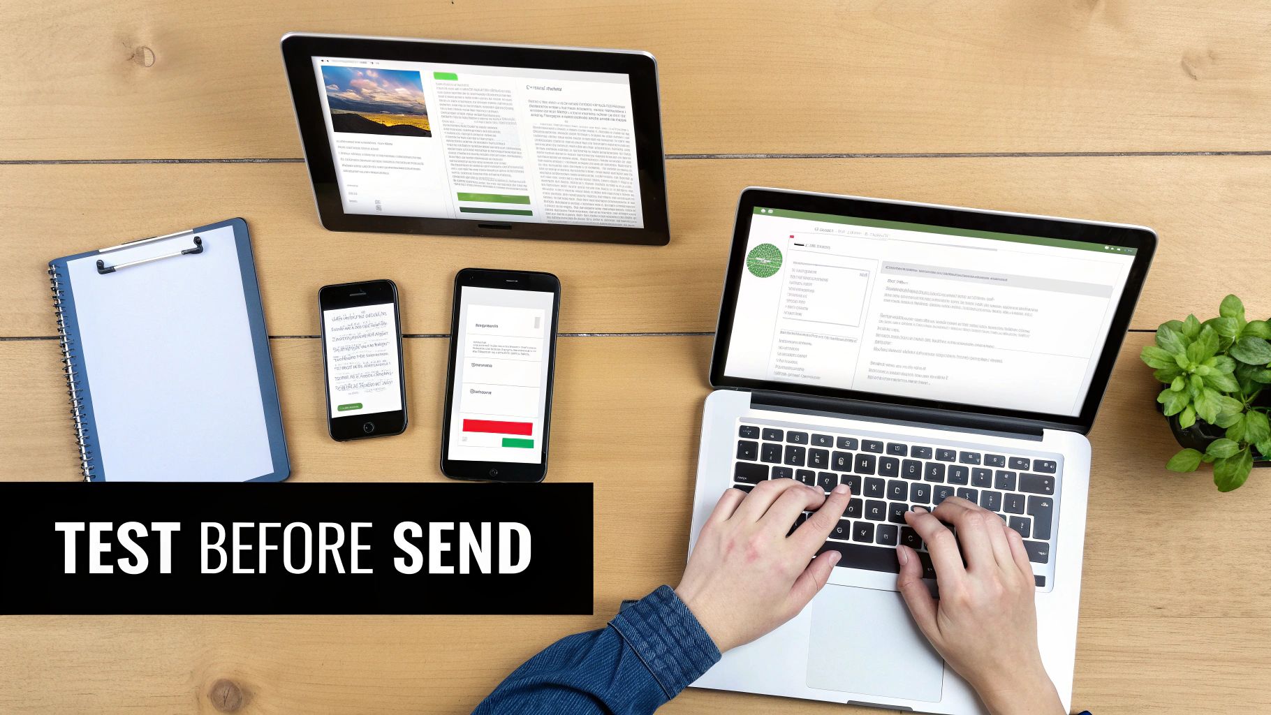
This goes beyond catching typos. It's about guaranteeing a flawless experience for every subscriber, no matter how or where they open your email.
Rendering Checks Across Clients and Devices
The single biggest headache in email design is that every email client—Gmail, Outlook, Apple Mail—interprets code differently. An email that looks perfect in one app can be a mess in another. You have to preview your template across as many environments as possible.
Specialized tools like Litmus and Email on Acid are invaluable here. They generate screenshots of your email as it appears in dozens of clients and devices, letting you spot and fix rendering bugs before your audience sees them.
Your pre-flight checklist should always cover:
- Major Clients: Verify how it looks in Gmail, Apple Mail, and especially the different versions of Outlook.
- Mobile vs. Desktop: Confirm your responsive design stacks correctly on small screens and expands gracefully on larger ones.
- Dark Mode: Check how your email appears when dark mode is enabled. Colors can invert, making text unreadable or logos look strange if you haven't planned for it.
The Functional and Deliverability Audit
Once you’ve confirmed the template looks good, make sure it works perfectly. A functional audit means clicking every link, testing every button, and verifying that dynamic content pulls through correctly.
For example, double-check that your personalization tags like {{first_name}} populate. You should also have a fallback value (like "there") in case the data is missing. Nothing looks more amateur than an email that opens with "Hello, ."
Beyond that, check your deliverability by running a spam test. This analyzes your template’s code and content for red flags that could send it to the junk folder. Most testing tools provide a "spam score" and offer specific advice, like fixing broken HTML or improving your image-to-text ratio.
Pro Tip: Never skip the human element. After your technical checks, send a final test to a few team members. A fresh pair of eyes is invaluable for catching subtle mistakes or awkward phrasing that automated tools will miss.
Creating a Comprehensive Testing Checklist
To make this process repeatable, build a reusable testing checklist. This ensures consistency and prevents mistakes, especially when you're on a deadline.
Here’s a simple structure you can adapt:
- Rendering Test: Does the email display correctly in Gmail, Outlook, and Apple Mail on both mobile and desktop?
- Link Verification: Do all links point to the correct URLs and include tracking parameters?
- Image Check: Are all images loading? Is alt text present and descriptive?
- Content Proofread: Has the copy been checked for spelling and grammar by at least two people?
- Personalization Test: Do all merge tags and dynamic content blocks work as intended, including fallbacks?
- Spam Filter Check: Does the template pass a spam test without major red flags?
This structured approach transforms testing from a chore into a reliable quality assurance process. It's the final piece in learning how to create an email template that performs flawlessly in the wild.
Putting Your Template to Work with Automation
A great template is a fantastic asset, but a template plugged into automation workflows is a powerhouse. This is where your design becomes a scalable system that saves time, builds customer relationships, and drives revenue while you focus on other things.
The real magic happens when you adapt your master template for key automated series, ensuring every touchpoint is consistent, professional, and effective.
Automated emails aren’t just a “nice-to-have”; they're a core part of modern email marketing. These triggered messages consistently outperform standard campaigns because they’re timely and relevant. Building a library of on-brand, automation-ready templates is one of the highest-impact things you can do.
Adapting Your Template for Key Automated Series
Your master template is the foundation, but different automated emails have different jobs. Instead of starting from scratch, create purpose-built variations by duplicating your master template and making small, strategic tweaks.
For example, a welcome email needs to be warm and introduce your brand, with a clear CTA like "Explore Our Best Sellers." An abandoned cart email, on the other hand, needs to be urgent and direct, with a bold "Complete Your Order" button and prominent images of the products left behind.
Expert Insight: Think of your master template as your brand's official uniform. Your automated templates are just versions tailored for specific jobs—one for welcoming new people, another for providing support, and a third for closing a sale. The core branding is the same, but the focus changes.
The Power of Triggered Emails
The data on automation is compelling. Automated emails often see significantly higher open and click rates than regular campaigns because they land in the inbox at the exact moment a customer expects or needs them.
Here are a few essential automated series you should build templates for:
- Welcome Series: Your first impression. This series should onboard new subscribers and set expectations.
- Abandoned Cart Reminders: A must-have for e-commerce. This template should be simple, visually reminding the customer what they left and making it easy to return.
- Re-engagement Campaigns: For inactive subscribers. This template could offer a special incentive or ask for feedback to win them back.
- Post-Purchase Follow-ups: This covers order confirmations, shipping notifications, and review requests. These transactional emails have incredibly high open rates and are a perfect opportunity to reinforce your brand.
By building out these variations, you're not just making a template; you're creating an entire communication system. This proactive approach is fundamental to building a strong email marketing campaign for maximum engagement.
Setting Up Your Automation Workflows
Once your templates are ready, plug them into your ESP’s automation builder. Even platforms like Gmail offer ways to set up powerful sequences. For more on this, check out this guide on creating automated email templates with Gmail.
The process involves defining a trigger (like "subscriber joins list") and then assigning the right email template to send. By investing the time to set this up once, you create an efficient system that nurtures leads, recovers sales, and builds brand loyalty automatically.
Summary & Your Next Step
Creating a high-performing email template isn't about jumping into a builder. It starts with a strategic plan: define a single goal, establish a clear visual hierarchy, build a modular system, and prioritize mobile-first, accessible design. Whether you use a drag-and-drop editor or custom HTML, the key is to test thoroughly before launch. Finally, adapt your master template for automated workflows to create a scalable system that works for you 24/7.
Your Next Step: Choose one of your existing email templates and audit it against the mobile-first and accessibility checklists in this guide. Identify one or two simple improvements you can make today to enhance the reader experience.
At EmailGum, we provide the strategies and insights you need to build powerful email campaigns. Start mastering your email marketing today by signing up for free at https://emailgum.com.
Article created using Outrank