An html email template is a pre-formatted HTML file that serves as a reusable blueprint for your email campaigns, ensuring your branding, layout, and messaging look consistent every time you hit send. Unlike the constraints of drag-and-drop editors, a code-based approach gives you complete control over the design and responsiveness, empowering you to create a pixel-perfect experience for your subscribers.
Why a Custom HTML Email Template is a Marketing Superpower
While drag-and-drop builders are convenient, their simplicity often comes at a cost: frustrating limitations that can dilute your brand identity and harm performance. A custom HTML email template, however, is a powerful asset for any serious marketer. It's about taking back control to deliver a flawless experience, from the inbox to the final click.
Think of it as the difference between a pre-fabricated house and a custom-built one. Both provide shelter, but only one is designed to your exact specifications. This level of precision directly impacts everything from how your email renders in tricky clients like Outlook to how effectively it lands in the primary inbox.
Step 1: Establish Total Brand and Design Control
With custom HTML, you are no longer confined by a builder’s pre-set blocks or limited styling options. This freedom is essential for creating a unique and memorable experience that reinforces your brand identity.
Here’s how this translates into practical benefits:
- Pixel-Perfect Branding: Match your website's typography, color palette, and spacing with absolute precision. This creates a seamless and professional brand journey for your audience.
- Unique, Engaging Layouts: Break free from generic, overused column structures. You can design innovative layouts that capture attention and strategically guide the reader's eye through your message.
- Guaranteed Rendering: By writing clean, standards-compliant code, you can specifically target and overcome the quirks of different email clients, ensuring your design never falls apart.
Expert Insight: A well-coded HTML email template isn't just about aesthetics; it’s a strategic tool for deliverability. Clean, simple code is less likely to be flagged by spam filters, which significantly boosts your chances of reaching the primary inbox.
Step 2: Build a Reusable Asset for Long-Term ROI
Investing time upfront to build a solid, modular template pays dividends down the road. A strong foundation can be quickly adapted for any type of campaign—from newsletters and promotions to transactional messages—saving your team countless hours. To make informed decisions, you can explore a deep dive into the strategic choices between HTML or plain text emails to understand when each format is most effective.
Of course, the template is only half the battle. The effectiveness of your emails also hinges on clear, professional communication. It's always a good idea to ensure your team is mastering email etiquette at work so your beautifully designed template can deliver its message with impact. This combination of strong design and clear communication is what truly drives results.
Laying a Bulletproof Foundation for Your Template

Now it’s time to roll up our sleeves and build the skeleton of a truly reliable html email template. This foundational code, often called a boilerplate, is the most critical piece of the puzzle. It’s the bedrock that ensures your design remains stable across the wildly inconsistent landscape of email clients.
Every line of code serves a vital purpose. This starter code is built for modern inboxes, so we’ll be ditching outdated practices you might see in older tutorials. Let's break down the components that make this structure so resilient.
Step 1: The Essential Boilerplate Breakdown
The first few lines in your HTML file dictate how email clients will interpret and render your content. Getting this part wrong is a recipe for rendering bugs and headaches down the road.
First, the DOCTYPE is non-negotiable. It signals to rendering engines that they should use modern standards, which is what we need for predictable layouts. The HTML5 doctype is perfect—it’s simple and universally supported.
Next are the meta tags, which are crucial now that most emails are opened on mobile devices. The viewport tag is the key to responsiveness; it tells phones how to scale your email correctly so users aren't left pinching and zooming.
Here is the essential code you need at the top of every template:
<!DOCTYPE html>: Tells email clients to use modern rendering standards.<meta http-equiv="Content-Type" content="text/html; charset=utf-8" />: Sets the character encoding to handle a wide range of symbols and languages.<meta name="viewport" content="width=device-width, initial-scale=1.0"/>: This is the magic line that makes your email responsive on mobile devices.
These initial elements are what tell every email client, "Hey, this is a modern, responsive email. Please handle it correctly."
Step 2: Taming Microsoft Outlook with Conditional Comments
Microsoft Outlook is the long-standing challenge for email developers. Why? Its desktop versions use the Microsoft Word rendering engine, which has notoriously poor support for modern web standards. To work around its many quirks, we must use conditional comments—special blocks of code that only Outlook can read.
These comments allow us to apply Outlook-specific fixes without affecting how the email looks in Gmail or Apple Mail. A common and effective technique is to wrap our entire email body in a "ghost table." This clever trick forces Outlook to contain the email's width and center it properly, solving one of the most common rendering nightmares.
Expert Insight: Think of conditional comments as secret instructions just for Outlook. They help you fix its unique rendering bugs, like ignoring standard width and alignment styles, ensuring your layout doesn't break for a significant portion of B2B audiences.
While powerful email builder tools can streamline this process by handling client-specific fixes for you, understanding what’s happening "under the hood" is key to troubleshooting when things go wrong.
Step 3: Use an Unbreakable Table-Based Structure
While the rest of the web development world has moved on to modern layout techniques like Flexbox and CSS Grid, email development remains firmly in the past. There’s a good reason for it: tables are the only layout method that works reliably everywhere. Every structural element of your email, from the main container down to individual content blocks, will be built using HTML <table> elements.
It feels old-school, but it's the only way to achieve a consistent look across all email clients. Our boilerplate will start with a main container table that sets the email's overall width (a 600px width remains the industry standard) and centers it. Inside that container, we’ll nest more tables for each section of content.
A typical email template structure breaks down like this:
- Pre-header: The short summary text that appears after the subject line in an inbox.
- Header: Typically contains your logo and primary branding.
- Body: The main content area for your message, images, and calls-to-action.
- Footer: Contains legally required information like your physical address, an unsubscribe link, and social media icons.
Each of these sections will sit inside its own table row (<tr>) and cell (<td>), keeping the entire layout organized and predictable. This modular, table-based approach is the secret to an unbreakable html email template.
Building Responsive Layouts with Modern CSS
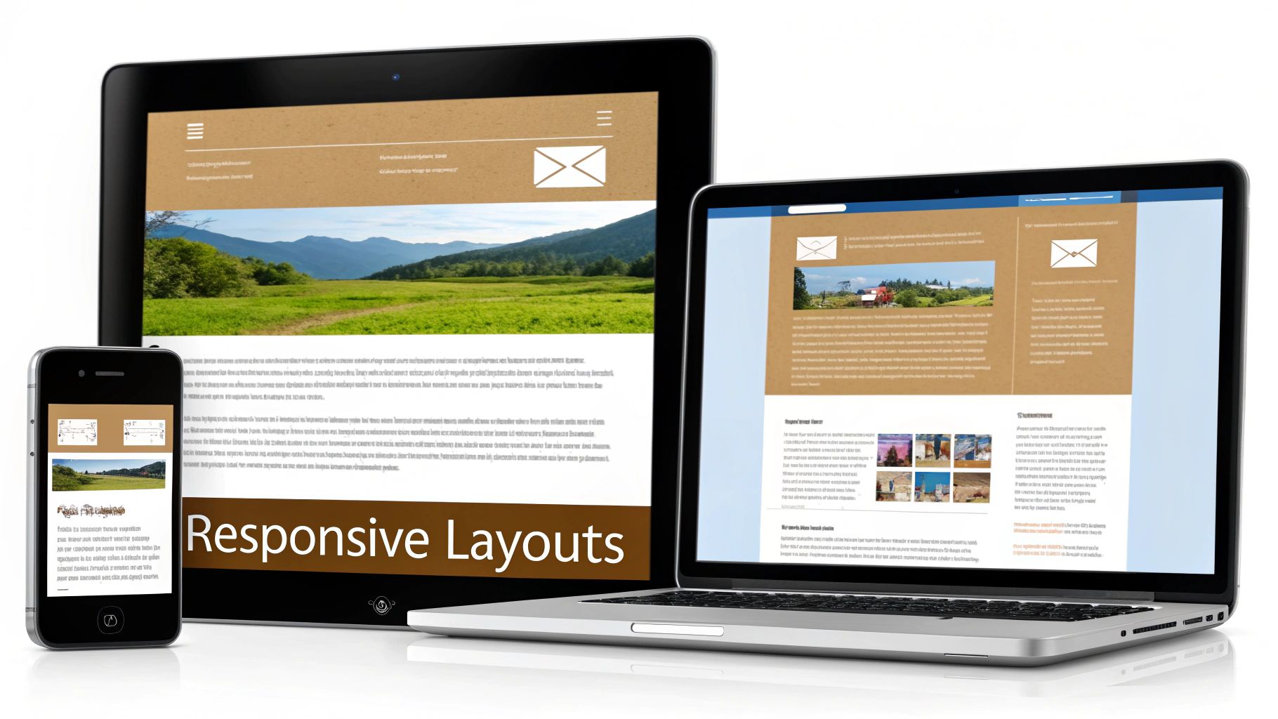
With a solid, table-based foundation in place, it’s time to make your html email template dynamic and responsive. A static, one-size-fits-all design no longer meets modern expectations. Your layout must adapt gracefully from a wide desktop monitor to the smallest smartphone screen. This is where the art of modern email development truly shines.
We'll achieve this using a powerful hybrid approach that combines the bulletproof reliability of fluid, table-based layouts with the flexibility of CSS media queries. The goal is a layout that is not only responsive but also robust enough to handle the rendering quirks of even the most troublesome email clients.
Step 1: Use Internal CSS for Easier Maintenance
For years, the golden rule of email development was "inline all your CSS." This meant painstakingly adding every style attribute directly into each HTML tag, which made updating templates a nightmare.
Thankfully, the email world has evolved.
A major shift in email client support has made internal CSS a surprisingly reliable way to style your templates. As of early 2024, internal CSS support has reached over 85% across popular email clients—a true game-changer for developers. The key is to place your <style> tag within the <head> of your document.
This modern technique dramatically simplifies template maintenance. No more hunting down individual style="..." attributes. Now, you can manage your design from a single, organized CSS block at the top of your file.
Step 2: Craft a Flexible Two-Column Layout
One of the most common responsive patterns is a two-column desktop layout that elegantly stacks into a single column on mobile. Let's build a practical example. We’ll start with two div containers nested inside a parent table cell.
First, create the container that will hold both columns.
<table role="presentation" border="0" cellpadding="0" cellspacing="0" width="100%">
  <tr>
    <td style="padding: 20px;">
      <!-- Column wrappers will go here -->
    </td>
  </tr>
</table>
Now, inside that <td>, we'll add our two columns. We’ll use a CSS class to control their behavior on mobile devices.
<!-- LEFT COLUMN -->
<div class="column-wrapper" style="width: 50%; float: left;">
  <table role="presentation" border="0" cellpadding="0" cellspacing="0" width="100%">
    <tr>
      <td style="background-color: #eeeeee; padding: 20px;">
        Content for the left column goes here.
      </td>
    </tr>
  </table>
</div>
<!-- RIGHT COLUMN -->
<div class="column-wrapper" style="width: 50%; float: left;">
  <table role="presentation" border="0" cellpadding="0" cellspacing="0" width="100%">
    <tr>
      <td style="background-color: #dddddd; padding: 20px;">
        Content for the right column goes here.
      </td>
    </tr>
  </table>
</div>
On a desktop, this code produces two columns side-by-side. However, without CSS, it will appear squeezed and unreadable on a mobile phone.
Step 3: Activate Responsiveness with Media Queries
This is where your internal stylesheet comes into play. We’ll add a media query that targets screens smaller than our 600px email width. These CSS rules will only apply on mobile devices.
Inside your <style> tag, add this code:
@media screen and (max-width: 600px) {
  .column-wrapper {
    width: 100% !important;
    float: none !important;
    display: block !important;
  }
}
Let's break down what this snippet does:
@media screen and (max-width: 600px): This is the trigger. It tells email clients, "If the screen width is 600px or less, apply the following styles.".column-wrapper: This targets the<div>elements we created for our columns.width: 100% !important;: This overrides the inlinewidth: 50%and forces each column to take up the full screen width.float: none !important;: This cancels the side-by-side float, causing the columns to stack vertically.display: block !important;: This reinforces the stacking behavior by ensuring the<div>acts as a standard block-level element.
Why
!important?
The!importantdeclaration is essential in email CSS. Because email clients are notoriously inconsistent in how they apply styles,!importantensures your media query rules override any inline styles set in the HTML. It's the key to making your responsive design work reliably.
This stacking column technique is a foundational skill in responsive email design. Once you master this pattern, you can build complex, multi-column layouts that look fantastic everywhere. Of course, a great layout is just one piece of the puzzle. For more on creating visually effective campaigns, explore these essential email design best practices.
Designing for Thumbs and Accessibility
Let's be clear: if your email looks bad on a phone, it's probably already in the trash. That's the reality of how people read—or, more accurately, scan—their emails today. Building your HTML email template with a mobile-first mindset isn't an optional feature; it's the foundation of modern email design.
The shift to mobile has been definitive. Data shows that over 50% of emails are opened on mobile devices, with some demographics reaching as high as 78%. You can dive deeper into the mobile email landscape on clean.email for more industry insights. This trend means your first impression is almost always made on a small screen.
Designing mobile-first forces you to prioritize your content, ensuring your core message is clear and your calls-to-action are impossible to miss, no matter the device.
Step 1: Nail the Small-Screen Experience
A mobile-first strategy is more than just stacking columns. It's about creating an experience that feels intuitive and effortless for someone scrolling with their thumb.
Here are the non-negotiable elements for any mobile-friendly email:
- Fluid Widths: Use percentage-based widths like
width="100%"in your media queries. This allows your layout to breathe, stretching and shrinking to fit any screen perfectly. - Readable Fonts: Tiny text leads to frustration and unsubscribes. Aim for a minimum body font size of 16px to ensure people can read your message without pinching and zooming.
- Tappable Buttons: Fingers are not precise cursors. Your buttons and links need to be large enough to tap easily. The industry standard is a minimum size of 44x44 pixels to prevent accidental clicks.
- Lightweight Images: Large, unoptimized images slow down your email's load time, especially on cellular connections. Always compress your images before adding them to your template.
Actionable Takeaway: The goal is to make interaction feel natural. If a user has to stop and think about how to read your content or tap a button, you've introduced friction that can cause them to abandon your email.
Step 2: Ensure Your Emails are Accessible to Everyone
An accessible email is one that everyone can understand, including subscribers who use screen readers or have visual impairments. This isn't just about inclusive design; it's smart marketing that ensures your message reaches the largest possible audience.
An accessible HTML email template comes down to a few key technical details that make a world of difference.
Here are three simple, high-impact accessibility wins:
- Use Semantic HTML Roles: Because emails are built with tables for layout, screen readers can mistakenly announce them as complex data tables. To fix this, add
role="presentation"to all of your layout tables (<table role="presentation" ...>). This signals to assistive technology: "This is for layout only; just read the content inside." - Write Meaningful Alt Text: Every image that conveys information needs descriptive alt text. Without it, a screen reader user gets no context. Instead of
alt="logo", writealt="Company Name logo". For purely decorative images or spacer GIFs, use an empty alt tag (alt="") so the screen reader knows to skip it. - Check Your Color Contrast: Low contrast between text and background colors is a major barrier for people with low vision. Use a free online contrast checker to ensure you have a contrast ratio of at least 4.5:1 for normal text and 3:1 for larger text.
By integrating these mobile-first and accessibility practices from the start, you create an HTML email template that looks great everywhere and delivers a respectful, effective experience for every subscriber.
Testing Your Template for a Perfect Launch
Alright, you’ve coded your HTML email template, and it looks perfect on your screen. But hitting "send" without rigorous testing is a gamble you can't afford to take. The final phase is ensuring the masterpiece you designed doesn't turn into a jumbled mess in someone else's inbox.
A solid testing workflow is what separates professional marketers from amateurs. It’s about protecting your brand’s reputation and ensuring every email you send delivers the intended experience.
Step 1: Use Professional Testing Tools
It's tempting to send a few tests to your own Gmail and Outlook accounts and call it a day. Don't. The world of email clients is a fragmented landscape of dozens of apps, browsers, and devices, each with its own rendering quirks.
This is why professional testing platforms like Litmus or Email on Acid are indispensable. These services take your HTML and show you screenshots of how it renders across over 100 different email clients and devices in minutes.
- Spot a rendering bug in Outlook 2016? You’ll see it immediately.
- Is your layout breaking on an old Android phone? You’ll know exactly what your subscriber sees.
- Are your brand colors inverted in dark mode? The screenshots will show you precisely where things went wrong.
Investing in one of these tools prevents embarrassing, brand-damaging emails from ever reaching your subscribers.
Expert Insight: A broken email erodes trust and is a fast track to the unsubscribe list. Thorough testing is your insurance policy against a poor subscriber experience.
Step 2: Use a CSS Inliner Before Launch
Even though we built our template with a modern internal stylesheet for easier development, there’s one final "old-school" step we need to take: CSS inlining.
This process automatically moves the styles from your <style> block and applies them directly to the individual HTML tags as inline style="..." attributes. Why is this necessary? Some email clients—notably older versions of Gmail and Outlook—still have inconsistent support for internal CSS. Inlining acts as a safety net, ensuring maximum compatibility by using the one styling method that virtually every email client understands.
You don't have to do this manually. Many free online inliners can handle this for you in seconds. Simply paste your complete HTML file, and the tool will return a fully inlined, campaign-ready version.
Step 3: Follow a Pre-Launch Bug Hunting Checklist
Once you have your template rendered across multiple clients, it's time to hunt for bugs. Keep a sharp eye out for these common rendering issues.
Here's a quick checklist to run through:
- Broken Layouts in Outlook: Check for weird gaps, stretched images, or columns that fail to align correctly. This is often caused by table width or image dimension issues.
- Dark Mode Inversion: How do your logos, images, and text appear when colors are inverted? If content becomes unreadable, you may need to add dark-mode-specific media queries.
- Font Rendering: Did your custom web font fail to load? Ensure you have solid, system-level fallback fonts (e.g., Arial, Helvetica, sans-serif) defined in your CSS to maintain readability.
- Link Functionality: Click every single link. A broken call-to-action renders the entire email ineffective.
- Image Display: Verify that images aren't being blocked by default and that your alt text is descriptive and displays correctly when images are turned off.
This systematic testing also signals to inbox providers that you're a legitimate sender, which helps keep your emails out of the spam folder. For a deeper dive, our guide on how to prevent emails from going to spam offers more practical deliverability tips.
Summary and Your Next Step
We've covered the entire process of creating a professional HTML email template, from building a solid table-based structure and using modern CSS to designing for mobile and accessibility. By following these steps and implementing a rigorous testing process, you can build templates that are resilient, effective, and look great in any inbox.
This flowchart serves as a simple reminder of the final, crucial steps before any launch.
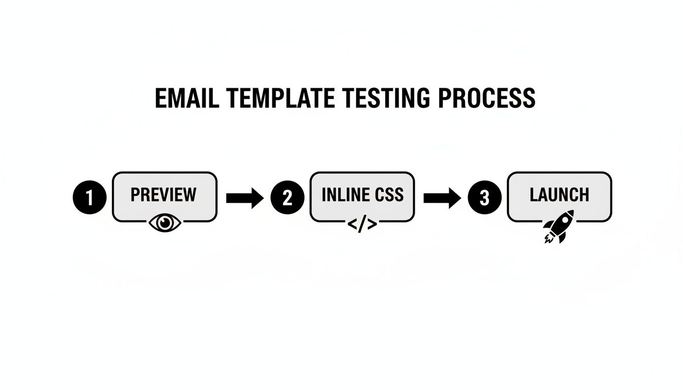
Previewing your design, inlining your CSS for maximum compatibility, and completing a final pre-launch check are your non-negotiable quality control gates.
Recommended Next Step: The best way to solidify what you've learned is to download a starter template and customize the header with your own logo and brand colors. This one simple task will turn theory into practical skill and leave you with a real, campaign-ready asset for your next marketing initiative.
Got Questions? I've Got Answers
Diving into HTML email development can feel like stepping back in time. Here are answers to some of the most common questions that new email developers ask.
"Why Can't I Just Use a Web Framework Like Bootstrap?"
This is a logical question for anyone coming from web development. The short answer is that email clients don't work like web browsers. Many popular clients, especially desktop versions of Outlook, use outdated rendering engines. Outlook, for example, uses the same engine as Microsoft Word.
These old-school environments completely ignore modern CSS like Flexbox and Grid, which are the backbone of frameworks like Bootstrap. Using them would result in a broken, unreadable email for a large portion of your audience. We are stuck with tables because they are the only layout method that works reliably everywhere.
"What's the Perfect Width for an Email Template?"
The long-standing industry standard is 600 pixels. This dimension has been battle-tested and provides the best compatibility across the widest range of devices. It looks great on large desktop monitors and scales down gracefully on narrow mobile screens.
While you might see templates pushing the boundary to 640px or even 700px, sticking to 600px is the safest bet to prevent users from having to scroll horizontally or pinch-and-zoom to read your message.
"How Do I Actually Handle Dark Mode?"
Getting dark mode right requires a two-part approach: meta tags and specific CSS. This ensures your email is just as beautiful and legible for users who prefer a darker interface.
First, you need to signal to email clients that your template supports dark mode. Add these two meta tags to the <head> of your HTML file:
<meta name="color-scheme" content="light dark"><meta name="supported-color-schemes" content="light dark">
Next, provide dark-mode-specific instructions within a special media query in your <style> block.
Expert Tip: The
@media (prefers-color-scheme: dark)media query is your secret weapon. Any CSS inside this block will only apply when a user is in dark mode. Use it to invert background colors, swap a dark logo for a light version, and adjust font colors to maintain perfect contrast.